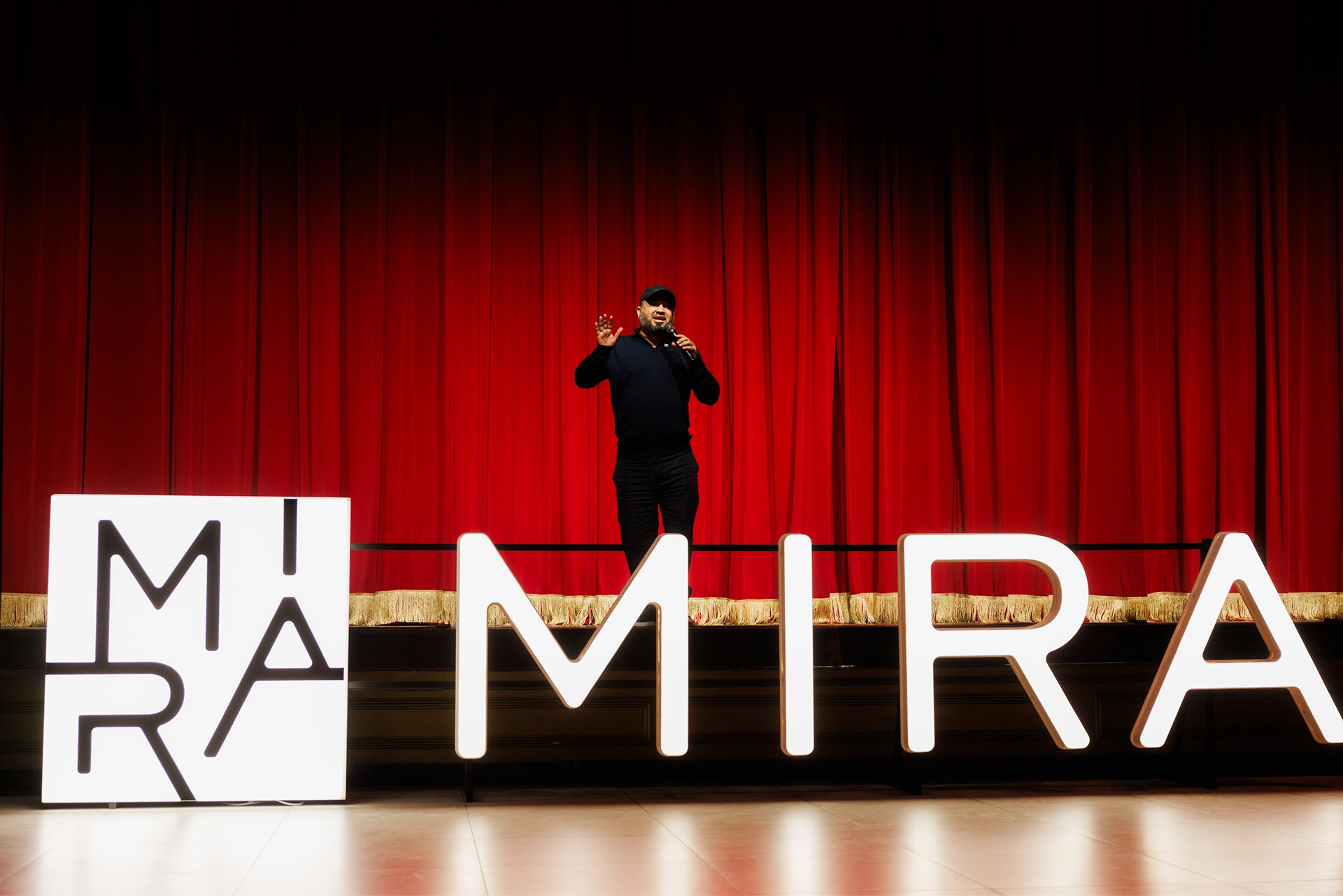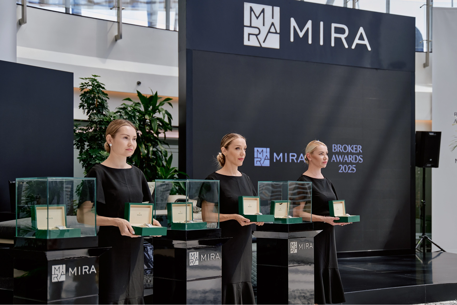
The Logo
Download Logo
ZIP (1,2 mb)
Our logo is our most valuable asset. It acts as the definitive signature across all communications. It should always be treated with respect and given room to breathe.
Clear Space & Minimum Size
To ensure maximum impact and legibility, always maintain a minimum clear space around the logo. This area must remain free of typography, graphics, or other elements.
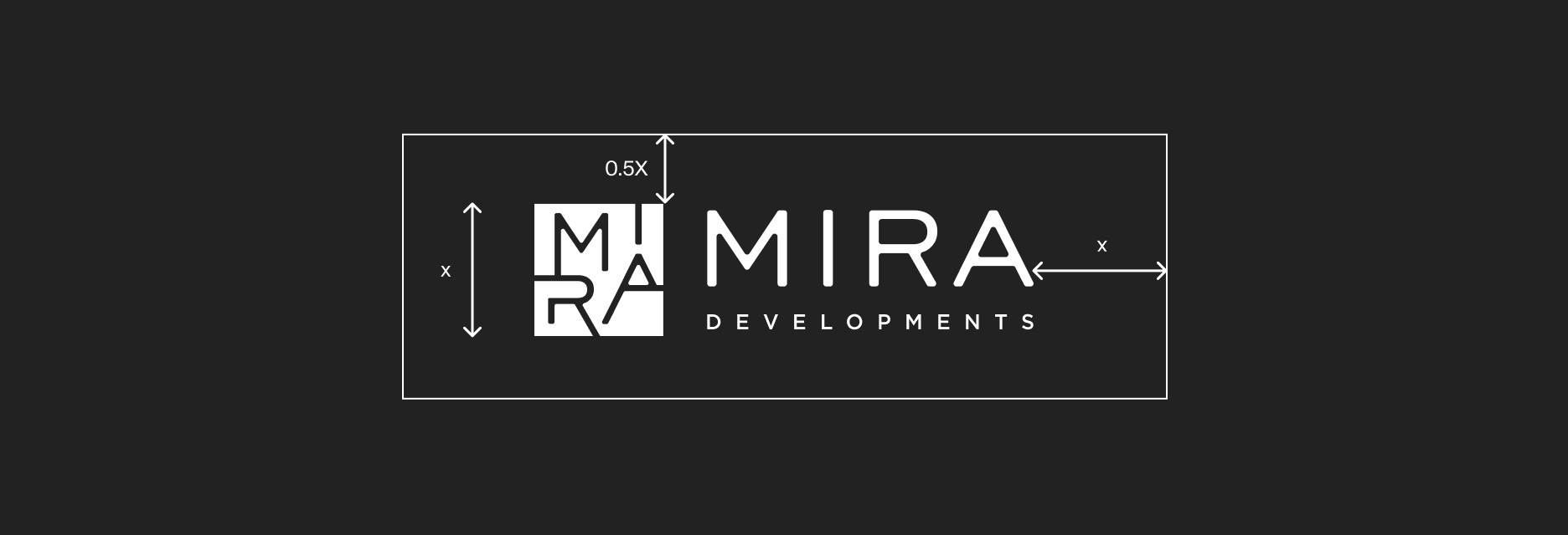
- Clear Space: X = The height of the logomark.
- Minimum digital size: 24px height.
Unacceptable Usage
Consistency is key. Do not alter the logo in any way.
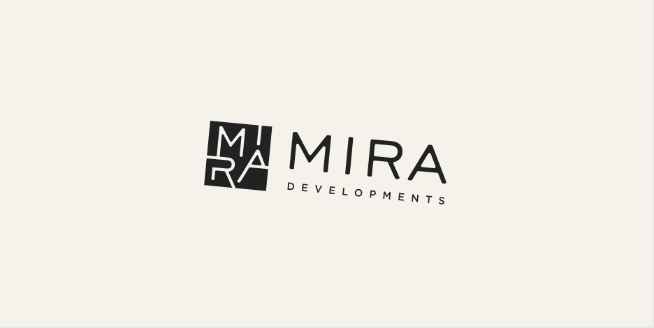
- Do not stretch, distort, or rotate the logo.
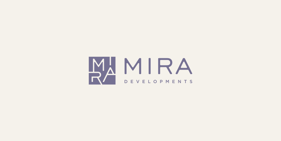
- Do not change the brand colors or apply unapproved gradients.
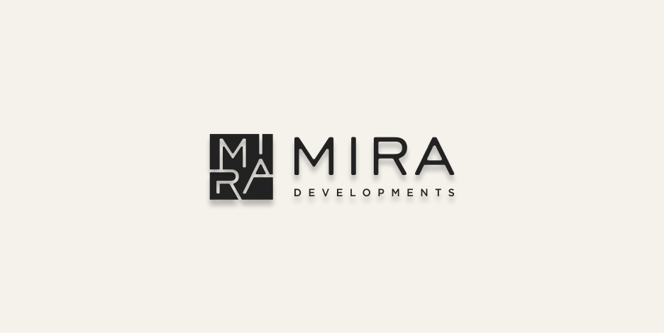
- Do not add drop shadows or external effects.
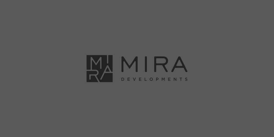
- Do not place the logo on complex, busy backgrounds that reduce contrast.
Spelling in the text
Every word in the company name is capitalized; all-caps words are not allowed.
Incorrect
MIRA Developments is setting a new standard for luxury living…
Correct
Mira Developments is setting a new standard for luxury living…
Typography
Our typographic system uses a dual-typeface strategy split by context. Inter handles all offline and non-web communications, while Ivy Mode and Suisse Intl are reserved exclusively for the website — together they define a refined, high-contrast digital identity.
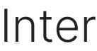
For Titles & Description
Primary Typeface: Inter
Inter is our main typeface for all non-website communications — offline materials, printed documents, presentations, and UI elements. A highly legible, modern sans-serif that brings clarity and neutrality to everything we make outside the web.
Usage: Body Copy, Titles, Offline Presentations, Printed Documents, UI Elements, Captions.
Rule: Prioritize readability and clean hierarchy. Rely on varied font weights to create logical structure and emphasis, maintaining an uncluttered and straightforward layout.
Download Inter
ZIP (19,5 mb)
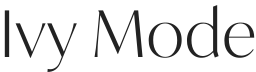
For Titles
Primary Typeface: Ivy Mode
Used exclusively on the website for headings, large display copy, and editorial statements. Ivy Mode brings character, high contrast, and a refined editorial feel to our digital identity.
Usage: H1, H2, Hero Statements, Quotes — website only.
Rule: Never use in body copy. Rely on dramatic scale for impact, not weight.
Download Ivy Mode
ZIP (52,4 kb)
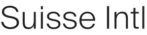
For Description
Secondary Typeface: Suisse Intl
Used on the website for body text, UI elements, captions, and secondary information. Rooted in the Swiss design tradition, it provides ultimate clarity and neutrality, allowing Ivy Mode headings to stand out.
Usage: Body copy, functional text, footnotes — website only.
Rule: Maintain generous line height (minimum 140%) to ensure breathability and legibility in the Light weight.
Color System
Our color palette is split by context. The website uses a warm, muted trio of tones that create a calm and premium digital environment. All other materials — print, presentations, offline documents — rely on a separate set of colors anchored in dark blue and beige, where white and black serve as supporting neutrals.
#222222
Graphite Black
Our primary color for typography and key graphic elements.
#F5F2EB
Canvas Beige
Our signature background color. This warm, understated off-white brings a sense of depth and physical presence to digital spaces.
#FFFFFF
Pure White
Used strategically for absolute highlights, elevated containers, or as a background when absolute neutrality is required.
#2A324B
Dark Blue
Primary brand color
#F5F2EB
Beige
Primary brand color
#000000
Black
Supporting neutral
#FFFFFF
White
Supporting neutral